OnePoint New User Experience Resource Center
Get Ready For The New User Experience
The New UI Transition Plan
Recorded October 2, 2019: As you know, OnePoint is planning to globally redirect all user logins to the New User Experience on the evening of November 13, 2019 between 7-9pm Pacific Time.
If you missed Scott Yokoyama’s live session for administrators outlining the transition plan and changes to expect the recording is availalbe now
New User Experience Training Library
-
New User Experience: Employee Self-Service
NEW Interactive walkthroughs of the new user experience.
Follow the orange prompts in these videos to experience how to navigate basic functions in the the new user interface.
- New UI Menu: https://app.snapapp.com/partnernewuimenu
- Manager Timesheet Experience: https://app.snapapp.com/partnernewuimgrtime
- Employee Timesheet and PTO Request: https://app.snapapp.com/partnernewuieetimesheet
- New UI Reporting: https://app.snapapp.com/partnernewuireports
- Employee Profile & Checklist Experience: https://app.snapapp.com/partnernewuieeprofile
Understand The biggest Differences:
Menu Navigation
- All of your menu items are now in a vertical layout. This will look different if you were using the classic experience, which had a horizontal layout. If you were using the standard theme in the classic experience, you had a similar vertical layout, but now, in the new experience, the menu items are organized into four different views.
- If you have Start items configured they’ll now show up as your Favorites
- My Account is now called My Info
- Manage Time, Employee Information, and Manage Payroll are now under My Team
- Our Company and Company Setting are now under Admin
The New Timesheet Experience
We have a new look for our timesheet. If you like using the classic timesheet, you can still use it, but over time, we will be adding more and more new cool features to the new timesheet, be sure to read our product update and watch the tutorial.
The Employee Profile
In our June release we gave our employee profile a makeover. We added what we call jump links to the right side of the screen. Don’t worry, all the fields you use regularly are still there – we just did a bit of remodeling.
If you are hesitant to jump right into this new view, or maybe even too busy to be disrupted, no problem. Continue to use the toggle button that lets you use the old view while you get used to the new one. But be sure to try out the new employee profile and we will be releasing a new search option on the screen to help users navigate it.
The Mobile App
When the classic experience goes away in August, so will the classic mobile app. If you have employees using the app (pictured below), you’ll want to have them start using the new app.

Configuring The New UI Home Screen and Assigning to Users
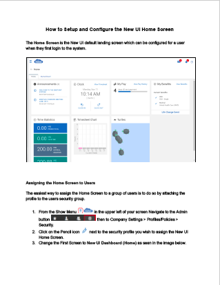
The Home Screen is the default landing screen that your users and employees see when they login to the new user experience. The Home Screen can be configured for users, or groups of users, by attaching the profile to the users security group. Follow this guide to see how to set up the default Home Screen within the New User Experience.
Download the Guide
New UI Reports, Charts, Dashboards User Guide
This guide walks through generating reports and creating charts for dashboards
The system offers extensive reporting options and capabilities for administrators and managers to gather and present data in a variety of ways. This guide provides user with options in reports generator to help understand the navigation, use of these options, save favorite report settings, schedule reports to run at specific times, and create charts and dashboards in your OnePoint instance.
Download User Guide
